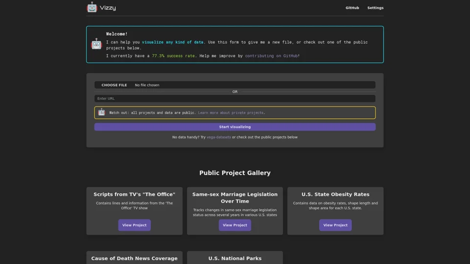
Overview
Vizzy is an AI-powered data visualization tool designed to transform raw data into engaging and understandable graphics. The platform is built for a wide audience, including students, researchers, and business professionals, who may not have expertise in data visualization software. By leveraging the power of large language models, Vizzy allows users to simply describe the visualization they want in plain English. The core value of Vizzy is its ability to democratize data visualization, making it fast and easy for anyone to turn data into compelling charts and graphs.
Product Features
- The platform's key feature is its ability to generate data visualizations from natural language prompts.
- It supports various types of data inputs, such as uploading a data file.
- The AI can create a wide range of visualization types, including scatterplots, bar charts, and maps.
- Users can conversationally enhance and tweak the visualizations with follow-up prompts to add titles, change colors, or add tooltips.
- It is an open-source project, making it free to use and allowing for community contributions.
Use Cases
- A student can upload a dataset from a science experiment and ask the tool to "draw a scatterplot of horsepower versus weight."
- A business analyst can ask to "show how sales have grown over time" to create a line chart for a presentation.
- A user can upload geographical data and ask to "color the data points by manufacturer" on a map.
- A researcher can quickly create various charts to explore a new dataset and identify trends.
User Benefits
- It makes the process of creating data visualizations incredibly simple and fast.
- The platform empowers users with no prior experience in data visualization tools like D3.js to create professional-looking graphics.
- It allows for rapid exploration and interpretation of data.
- The conversational interface provides an intuitive way to build and refine charts.
- As an open-source tool, it is free and accessible to everyone.
FAQ
- What AI model does Vizzy use? The platform is powered by large language models like OpenAI's ChatGPT to understand the user's request and generate the appropriate code (often using libraries like D3.js) for the visualization.
- Is my data kept private? The platform's documentation notes that all projects and data used with the public demo are public. This is a critical point for users to be aware of; sensitive data should not be uploaded to the public tool.
- What if the AI doesn't get the chart right? The platform acknowledges that the AI might sometimes produce an error or a broken graph. Users can try rephrasing their prompt or can directly edit the underlying code themselves to make minor fixes.
- Is this tool good for complex business intelligence? It is an excellent tool for rapid, ad-hoc data visualization and exploration. For complex, enterprise-level business intelligence with ongoing dashboards, a more traditional BI platform like Tableau or Power BI might be more suitable.
- Can I run it on my own machine? Yes, as an open-source project, the code is available on GitHub, and users with the technical knowledge can run the application locally for private use.
